Up until now, we have explored the most basic concepts of which you should be aware of before getting your career started in Machine Learning.
In this tutorial, you will learn the most important aspects of the Matplotlib data visualization library. If you aren’t already familiar with this tool, let’s get you updated about this module.
Why Should You Learn Matplotlib?
Matplotlib is a visualization library. You might ask yourself: What is the essential point of visualization? Why is the field of computer vision rising compared to other areas like Natural Language Processing (NLP)?
Well, it’s for the exact purpose that a picture represents a thousand words.
Understanding the concept behind Matplotlib is beneficial as you are capable of creating various kinds of visualization charts. These include line graphs, pie charts, scatter plots, histogram plots, box plots, bar plots, heatmaps, Time series plot and 3D graphs.
Alright, let’s not waste any time. Let’s look into making these different types of charts both with real-world datasets and toy-data.
Lets first see how you can install this package then explore concepts related to Matplotlib. If you already have this library installed, you may skip the following process.
How to Install Matplotlib?
Suppose you have Anaconda installed on your computer already. In that case, you may skip this process since Pandas comes preinstalled once you install Anaconda, which includes Data Science packages suitable for Linux, Windows, and macOS.
If you don’t have the library already installed or you are not using Anaconda, I strongly recommend installing it to avoid missing dependencies. Or you may choose to ignore me by entering these commands on your command line:
1 | $ pip install matplotlib |
Once you have followed the tutorial or installed the Anaconda Stack, you should have Matploblib installed. When installed, you can import the following stack of libraries we will utilize throughout this tutorial:
Note: Before starting the tutorial you may find the link to the GitHub repository for the code here. (this contains all datasets and the script for this tutorial).
Simple Line Plot
 →
→ 1 2 3 4 5 6 7 8 | # import the necessary packages %config InlineBackend.figure_format = 'retina' import matplotlib.image as mpimg import matplotlib.pyplot as plt from matplotlib import cm import pandas as pd import numpy as np import random |
Let’s begin by representing the simple mathematical function \( y = f(x) \) using matplotlib.
Before continuing this tutorial, I strongly recommend you go through the tutorial related to NumPy if you aren’t already familiar with each command’s purpose.
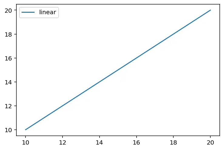
1 2 3 4 5 6 7 8 9 10 11 | # generate toy-data data = np.linspace(10, 20, 10) # visualize the data plt.plot(data, data, label='linear') # add a legend to the plot plt.legend() # diplay the figure plt.show() |
To get started in line 2,np.linspace(10, 20, 10) generates evenly spaced samples of 10 numbers between 10 and 20.
Next, the method called in line 5 plt.plot() displays the graph inside the figure.
In line 11 theplt.show() method invokes the plot viewer window to display the figure to our screen.
1 2 3 4 5 6 7 8 9 10 11 12 13 14 15 | # instantiated the figure and an axes figure = plt.figure() axis = plt.axes() # generate toy-data data = np.linspace(10, 20, 10) # visualize the data axis.plot(data, data, label='linear'); # add a legend to the plot axis.legend() # diplay the figure plt.show() |
Now you have seen the easiest way to create such a plot. For you to be informed, an alternative way to display such plots is to start by creating:
- A figure (a container that contains everything inside of a plot such as titles, subtitles, text, legends, labels, and graphics).
- And, an axes (has our actual plot, the labels, bounding boxes, and ticks on the x and y-axis).
We can start by calling the plt.figure() method, which generates a figure, and theplt.axes() produce the ticks and labels you have seen.
Let’s create a simple example, then visualize it, and add a legend (an area describing the elements of the graph) to the chart.
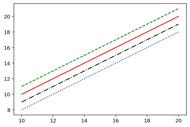
1 2 3 4 5 | plt.plot(data, data + 0, '-r') # solid red line plt.plot(data, data + 1, '--g') # dashed green line plt.plot(data, data - 1, '-.k') # dashdot green line plt.plot(data, data - 2, ':b') # dotted blue line plt.show() |
If we choose to generate a figure with multiple lines on it, we can call the plt.plot() method multiple times.
To spice up our visualization, we can adjust the linestyle and the color code connecting both non-keyword arguments to the plt.plot() function in matplotlib.
Multi-line plot
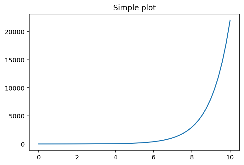
1 2 3 4 5 6 7 8 9 | # create a toy data x = np.linspace(0, 10, 50) y = np.exp(x) # generate a figure and only one subplot figure, axis = plt.subplots() axis.plot(x, y) axis.set_title('Simple plot') plt.show() |
Up until now, we have worked with plt.plot(), however, if we want to make additional plots or to work with plots in an object-oriented way, then I will recommend you create your plots using the plt.subplots() method (Notice it’s with the s at the end).
Now let’s begin by creating simple toy data for visualization purposes.
We will go ahead by calling the plt.subplots() method, which generates a figure, and if we don’t specify the number of rows and columns, it returns by default one axis, a one by one row and column.
Then to set the title of the plot, we called the axis.set_title() method, which enables us to do so.
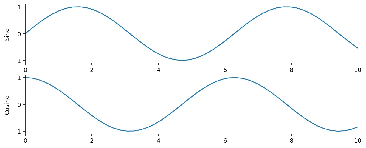
1 2 3 4 5 6 7 8 9 10 11 12 13 14 15 16 17 18 19 | # create another toy data a = np.linspace(0, 10, 50) b = np.sin(a) c = np.cos(a) # generate another figure and multiple subplots. # for this example we have only 2 rows and 1 column figure_2, axis = plt.subplots(nrows=2, ncols=1, figsize=(10, 4)) # visualize the data axis[0].plot(a, b) axis[0].set_xlim([0, 10]) axis[0].set_ylabel('Sine') axis[1].plot(a, c) axis[1].set_xlim([0, 10]) axis[1].set_ylabel('Cosine') plt.show() |
Next, to generate multiple axes, meaning more rows and columns, we will need to specifically pass in the arguments within the method call to matplotlib to create the number of the axis we want.
Within lines 12 – 13, the axis[0].set_xlim() helps us limit the view within our x-axis and the axis[0].set_ylabel() sets the label for the y axis. This also applies to lines 16 and 17.
Bar Plot
A bar chart is a type of chart used to display the relationship between values and categorical data. As you can see from the figure, the categorical data are presented to us with rectangular bars with heights associated with the values they represent.
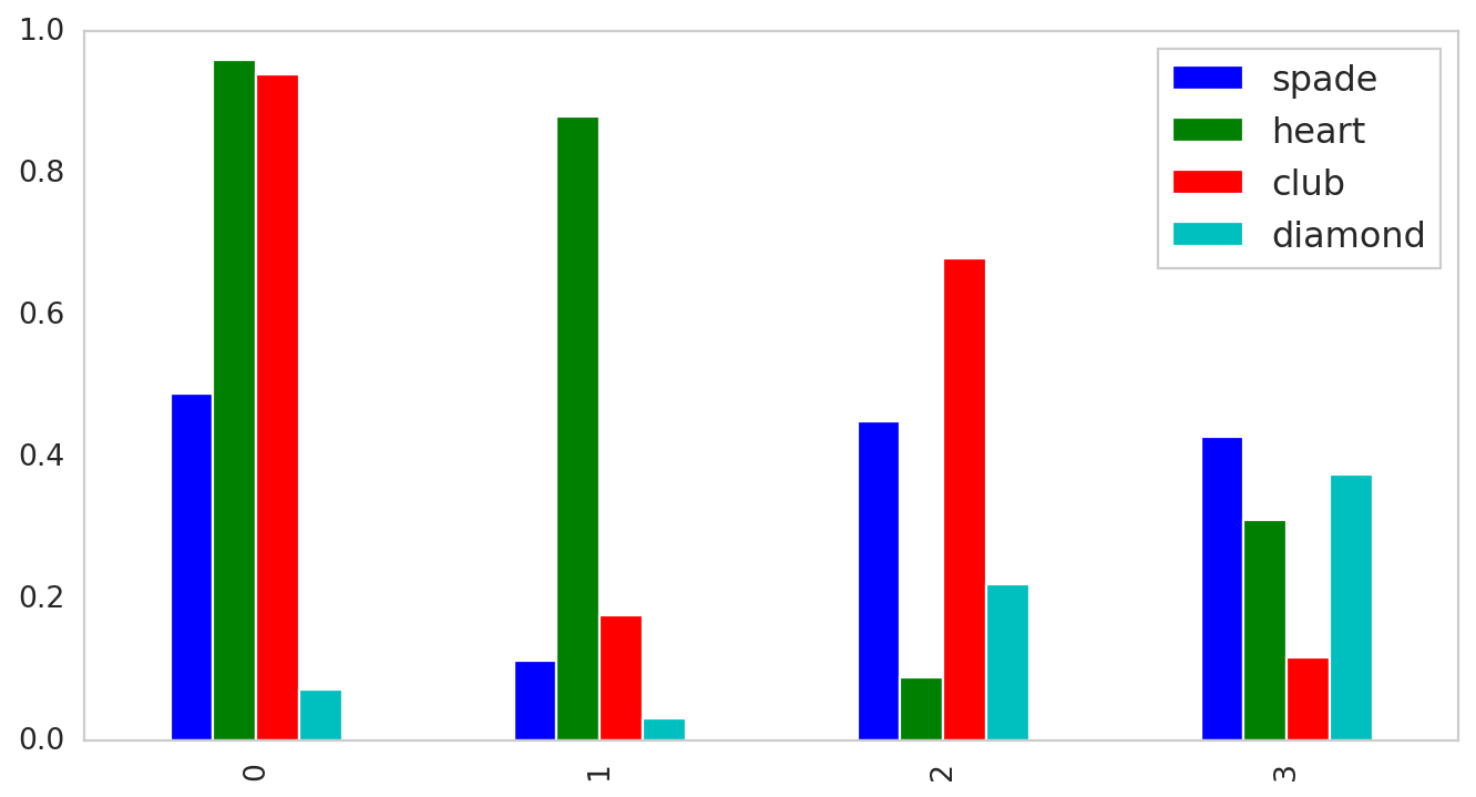
Let’s take as an example a deck of cards, which is a form of 52 cards and 4 French suits: clubs (♣), diamonds (♦), hearts (♥) and spades (♠). We have 13 ranks within each suit, which includes an Ace, cards from 2 – 10, a Jack, Queen, and a King.
Let’s say we have the whole deck of cards within a non-transparent bag. All shuffled around. Then we put a blindfold on the person’s face to make sure he/she doesn’t peep on what exactly his/she is picking. Since a deck of cards can be represented as a uniform distribution, it means that an individual has an equal chance of drawing a spade, a heart, a club, or a diamond.
1 2 3 4 5 6 7 8 9 10 11 12 13 14 15 16 17 18 19 20 21 22 23 24 | # generated a toy-dataset data = pd.DataFrame(np.random.rand(4, 4), columns=['spade', 'heart', 'club', 'diamond']) # the amount of times we will draw a card random_pick = np.arange(len(data.iloc[0, :])) # a list of values within each category pick_1 = data.iloc[:, 0].values pick_2 = data.iloc[:, 1].values pick_3 = data.iloc[:, 2].values pick_4 = data.iloc[:, 3].values # visualizing the figure figure = plt.figure(figsize=(10,5)) axis = figure.add_axes([0, 0, 1, 1]) axis.bar(random_pick + 0.0, pick_1, color='b', width=0.19) axis.bar(random_pick + 0.19, pick_2, color='g', width=0.19) axis.bar(random_pick + 0.38, pick_3, color='r', width=0.19) axis.bar(random_pick + 0.57, pick_4, color='c', width=0.19) axis.set_xticks(random_pick) axis.legend(data.columns, loc='upper right') plt.show() |
First, in lines 2 – 3, create a Numpy array of size 4×4, randomly picked from a uniform distribution.
Next, within line 6, we can get the total number of indexes we mentioned about having four different French suits.
Then from lines 9 – 12, we got each row of which denotes the probability of either picking a card that’s a club (♣), diamond (♦), heart (♥), or spade (♠).
Finally, from lines 15 – 21, we made multiple bar charts adjusting the thickness by 0.19 units, and 0.19 units will shift the bars’ position from the previous one.
Specifically within line 16, the signature call figure.add_axes([0, 0, 1, 1]) represents (\( x_{0} \), \( y_{0} \)) and its width and height so as the new axes within the figure is positioned in absolute coordinates on the canvas.
1 2 | data.plot(kind='bar', grid=False, figsize=(10,5)) plt.show() |
As another option, you may make the bar plot directly from the pandas DataFrame, by specifying the kind of plot you want to visualize, and turn off the grids that get rid of those numbered axes.
Histogram Plot
The histogram plot represents numerical data in the form of a group. It’s a bar plot where the X-axis represents the bins or buckets while the Y-axis provides information about its occurrence or frequency. Let’s see how we can generate one.
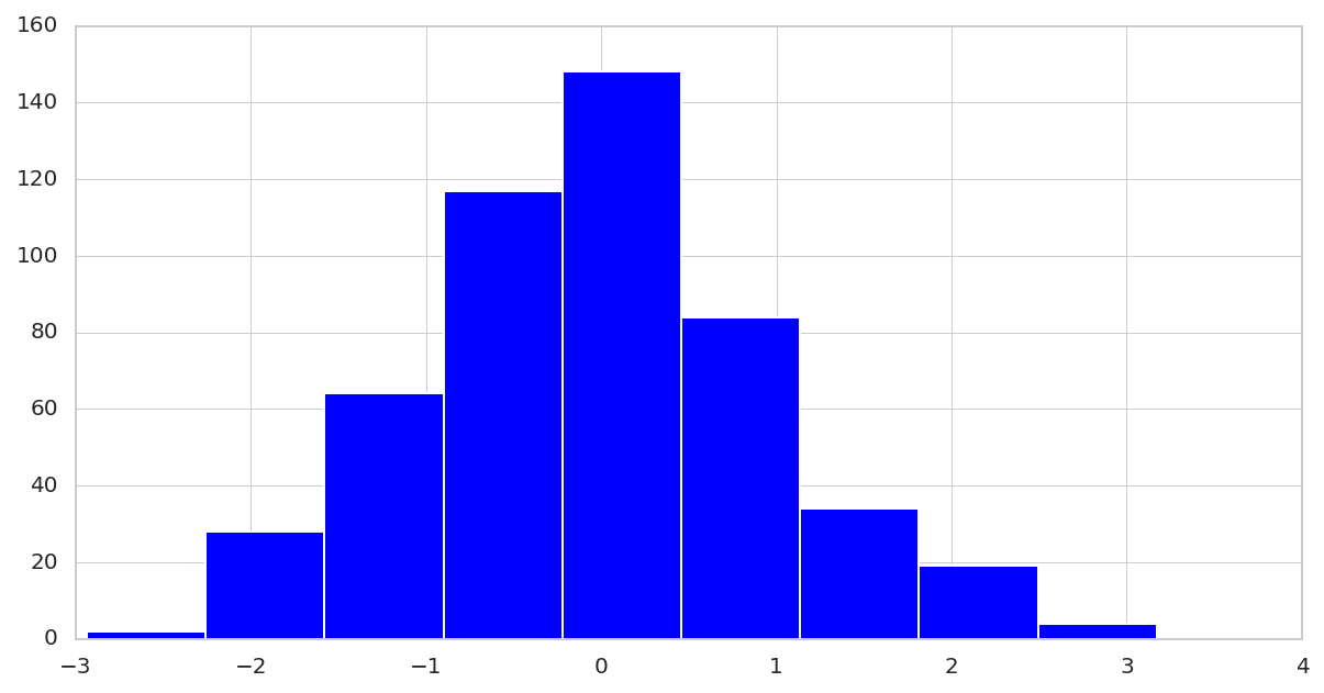
1 2 3 4 5 6 7 | # generate toy-data with normal distribution x = np.random.randn(500) # visualize the data plt.figure(figsize=(10, 5)) plt.hist(x, bins=9) plt.show() |
Let’s start by generating 500 random numbers from the Gaussian distribution then visualize the histogram. We can also specify the number of bins or buckets (different numbers of a group).
Box Plot
Most often, you will hear box plots called ‘box and whisker’ plots. It should not confuse you as they have both the same meaning.
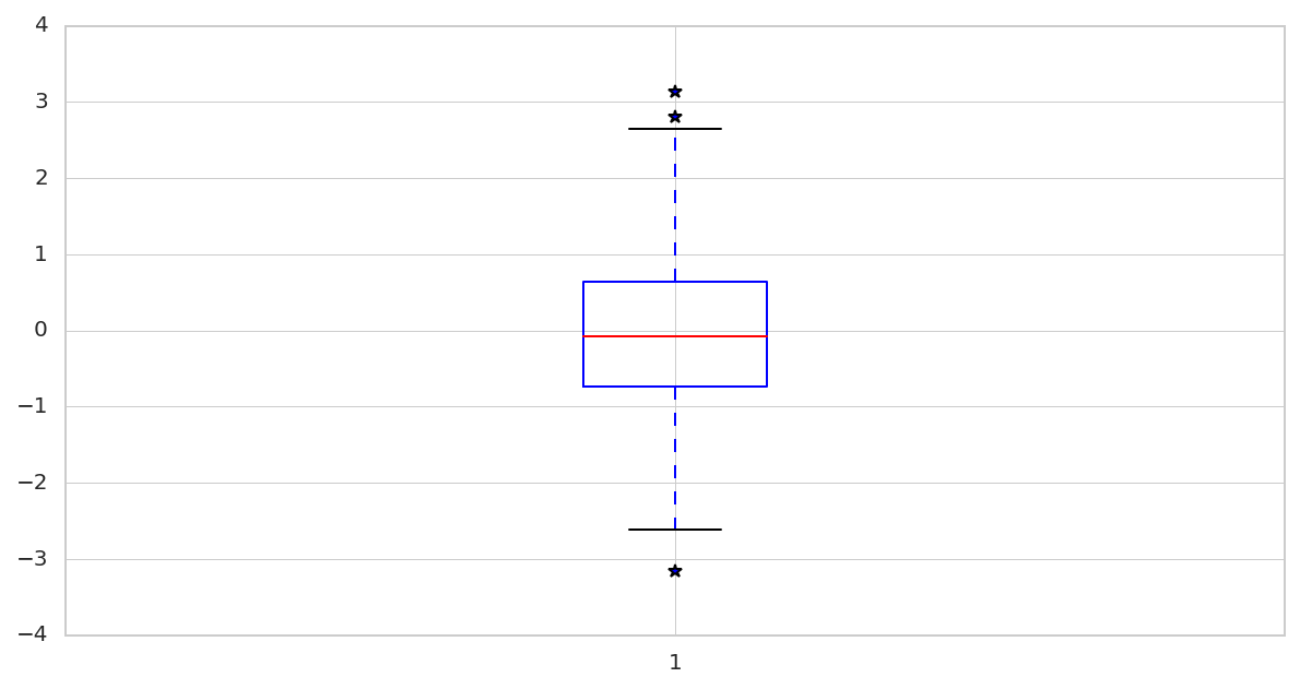
1 2 3 4 5 6 7 | # generate toy-data with normal distribution x = np.random.randn(500) # visualize the box plot # with sym=* we denote outliers - values outside the lines plt.boxplot(x, sym='*') plt.show() |
Here the box is simply the rectangular box you can see above on the diagram, and the whiskers are those dashed lines that go both upwards and downwards.
You should be aware that the red line at the middle of the box is called the median value. It’s also good to note that 50% of the data is above the median, and 50% of data is below the median value up until the black line.
One scenario I love using the median values is when I have outliers. Medians aren’t affected by outliers like the mean or average value.
For example, we want to measure the rainfall in 4 various Belgrade locations in Serbia, and we placed four rain gauges in different parts of the capital. Then we got a reading of 680ml, 682ml, 676ml, and 20ml per year. If we take the average of these values, we will get around 514.5ml.
By taking the median, we will get 681ml, which is reasonably close to the values compared to when taking the average or mean value.
Finally, the asterisks you see outside of the horizontal lines (or whiskers) denote outliers within our data.
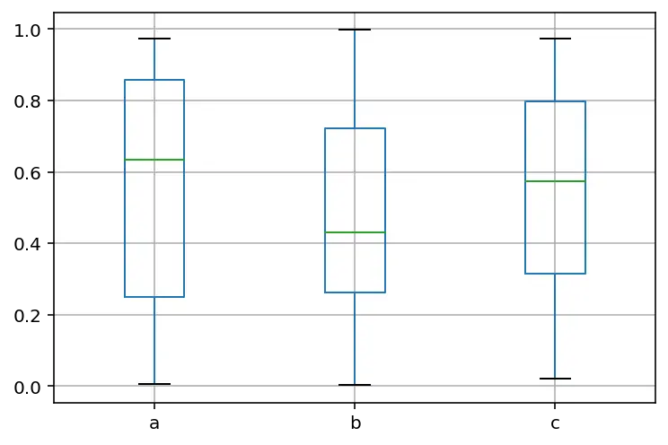
1 2 3 4 | data = pd.DataFrame(np.random.rand(50, 3), columns=['a', 'b', 'c']) data.boxplot() plt.show() |
Let’s say we want to make multiple box plots within the exact figure that we created initially. We need to call the .boxplot() method from the Pandas library then show it on the current window.
Visualization of Tesla Stock
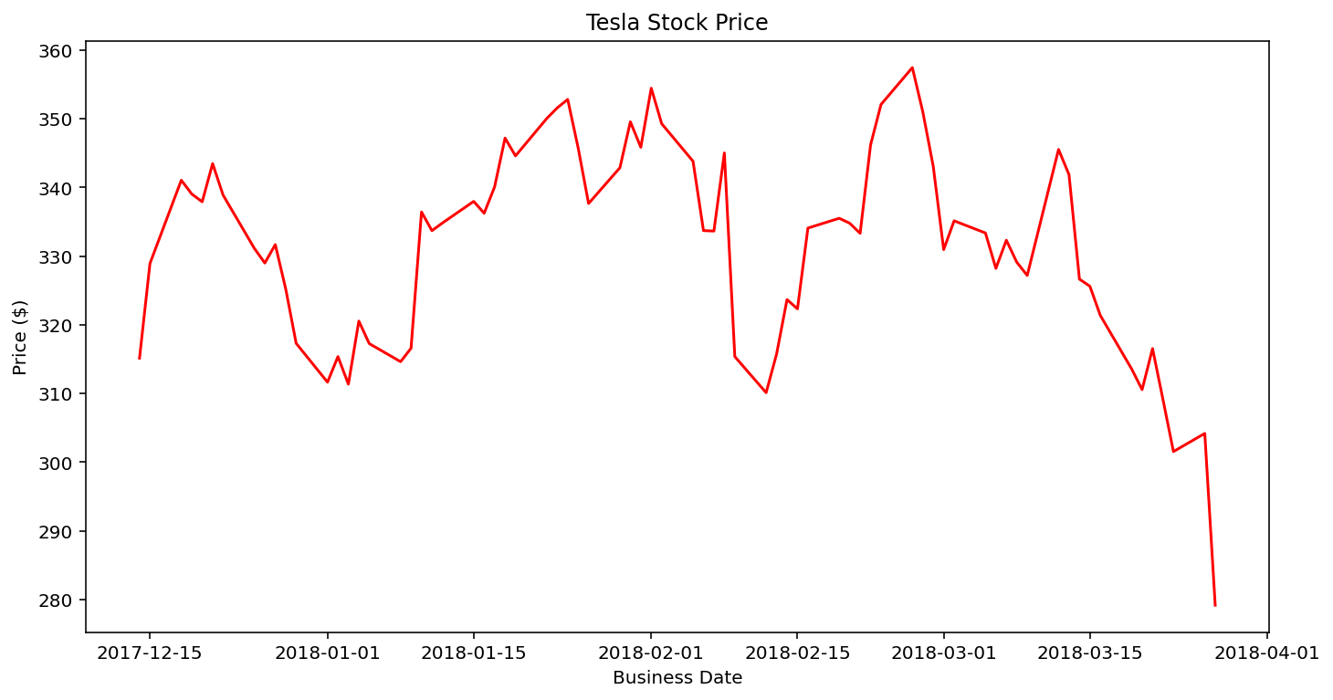
1 2 3 4 5 6 7 8 9 10 11 12 13 14 15 16 17 | # loading the csv file tesla_data = pd.read_csv("TESLA.csv") tesla_close_price = tesla_data.iloc[-74:]['Close'] # generate a fixed frequency DatetimeIndex, with business day tesla_date = pd.bdate_range(start="14/12/2017", end="27/03/2018") # visualize the data figure = plt.figure(figsize=(10, 5)) axis = figure.add_axes([0.1, 0.1, 0.9, 0.9]) plt.plot(tesla_date, tesla_close_price, c='red') # adding title and labels plt.title('Tesla Stock Price') plt.ylabel('Price ($)'); plt.xlabel("Business Date") plt.show() |
To make a time-series plot, I got this dataset of the Tesla stock from 2015 up until 2018, so let’s see how to visualize the change within its price.
First, within lines 2 – 3, we imported the CSV file and then using pandas indexing loc to select only the last 74 rows and the column Close within our data.
Next, within line 6, we selected all the business days from 14/12/2017 up until 27/03/2018. Using the method pd.bdate_range, it returns a fixed frequency of DateTimeIndex with the business days as default.
From lines 9 – 11, we created a figure, set the axis, and plotted our data. Note the c parameters is to specify the color of the line.
Then from lines 14 – 16, we added the plot’s title, set the new axes within the figure to be positioned in absolute coordinates on the canvas, and then added labels for both the X and Y-axis.
3D Pie Chart
One way to think of pie charts is to show percentage data or the percentage representation by each category provided next to the corresponding slice of pie. Let’s see how we can generate one by ourselves.
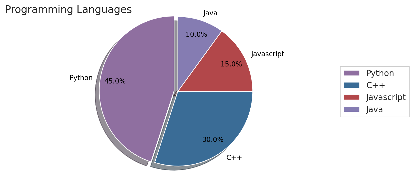
1 2 3 4 5 6 | # generate a figure figure = plt.figure(figsize=(9, 4), dpi=100) # create a toy data languages = ['Python', 'C++', 'Javascript', 'Java'] population = [45, 30, 15, 10] |
Within line 2, we created a figure, using the plt.figure()method and passed in a few arguments like the figsize, which sets the width and height of the figure in inches, and dpi (dots-per-inch) that controls the resolution of the figure. By default, it’s 100dpi.
8 9 10 11 12 13 14 15 16 17 18 19 | # generate random color arrays using random values color_list = [] for i in np.arange(len(languages)): random_rgb_color = (random.uniform(0.2, 0.7), random.uniform(0.2, 0.7), random.uniform(0.2, 0.7)) color_list.append(random_rgb_color) # separate the biggest slice from the rest of the pie explode = [0] * len(languages) # array broadcasting explode[0] = 0.05 # specify the distance |
From lines 11 – 15, we generated random colors (from a uniform distribution), which will be used to set each slice’s colors within the chart.
Then lines 18 and 19 help us separate the most significant slice from the rest of the pie by multiplying the first value within our list by a constant value.
21 22 23 24 25 26 27 28 29 30 31 32 33 34 35 36 | # specified the data and the labels and how thee values # should be displayed, the colors, add some shadows for # beauty, how much the pie should be rotates, and the # color of the text used in the plot wedges, texts, autotexts = plt.pie(population, labels=languages, colors=color_list, autopct='%1.1f%%', shadow=True, startangle=90, pctdistance=0.8, explode=explode, textprops=dict(color="black")) # Create legend to right and move off pie with the axes point width plt.legend(wedges, languages, loc='right', bbox_to_anchor=(0.7, 0, 0.5, 1)) plt.axis('equal') plt.title('Programming Languages', loc='left', fontdict={'fontsize': 15, 'fontweight': 'medium'}) plt.show() |
From line 25 – 29, we can generate our chart by passing the population with those individual languages. Then for our labels, we can set the language:
- labels: the different language types
- explode: Specify which ones explode
- colors: the randomly generated colors
- autopct: define how many decimal places each value should have since the languages will be displayed as a percentage of a hundred.
- shadow: if you want a shadow underneath of your graph.
- startangle: determine the starting angle of rotation.
- textprops: Set the text color.
To add a legend to our graph, we should pass in the wedges and languages variables, loc for the location and bbox_to_anchor to specify where to move the chart, like 0.7 and 0.5 to the right side of the plot.
Saving Visualized Plots
Until now, we have generated a lot of plots. What if we want to write the graph into our local disk (in the form of .png, .jpg, .jpeg, .pdf) instead of displaying it on our window?
1 2 | # Plots of different file types can be used. e.g: jpeg, jpg, png, svg, pdf, etc figure.savefig('programming_languages_pie_chart.png') |
Suppose you require some additional basic functionality of saving charts to file. In that case, the .savefig() method, indeed has several practical optional arguments you may choose to explore on their documentation page.
Scatter Plot
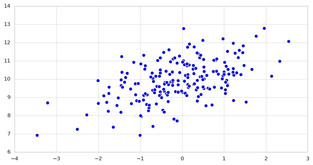
A Scatter plot is a simple type of graph in which values of two variables are plotted along two axes. The major goal is to reveal any correlation or relationship between the variables if it’s present. Let’s see how to compare two variables and later three variables at a time.
1 2 3 4 5 6 7 | # generate toy-data with normal distribution x = np.random.randn(200) y = x * 0.6 + np.random.randn(len(x)) + 10 # visualize the data plt.scatter(x,y, s=45) plt.show() |
In lines 2 – 3, let’s generate 200 random samples from a Gaussian distribution stored within the x variable.
Then generate 200 random samples as in line 2, and shift the mean within the y-axis to 10 and the standard deviation to 0.6.
In lines 6 – 7, let’s visualize the relationship between the x and y variables. As you can see from the graph, there’s undoubtedly a positive relationship between both variables.
Note in line 6; the parameter s defines the size of the marker on the graph.
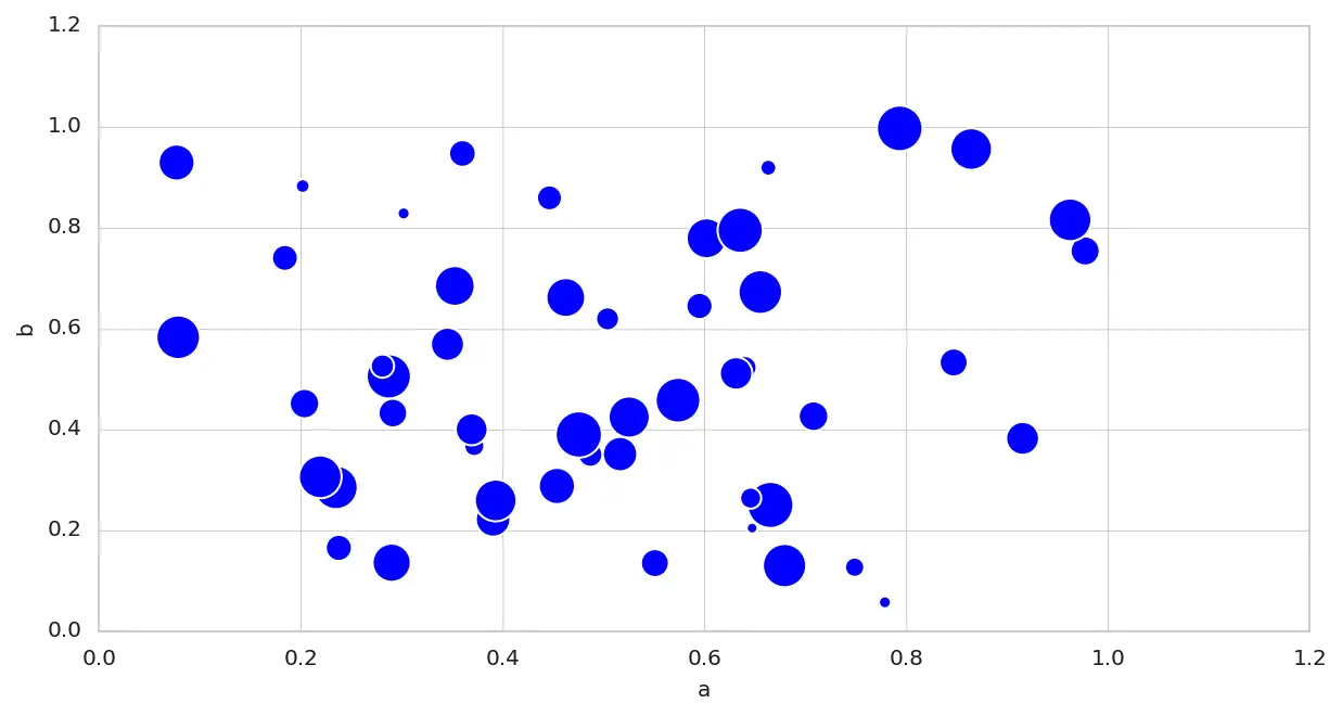
1 2 3 4 | # 2-D data data = pd.DataFrame(np.random.rand(50, 3), columns=['a', 'b', 'c']) data.plot(kind='scatter', x='a', y='b', s=data['c']*500) plt.show() |
Another option is to make the scatter plot after creating the Pandas DataFrame, where the kind=scatter. Where the X-axis is associated with column a, while the Y-axis is connected with column b. Then for the size of each marker, it will certainly depend on the values in column c.
3D view of the Iris Dataset
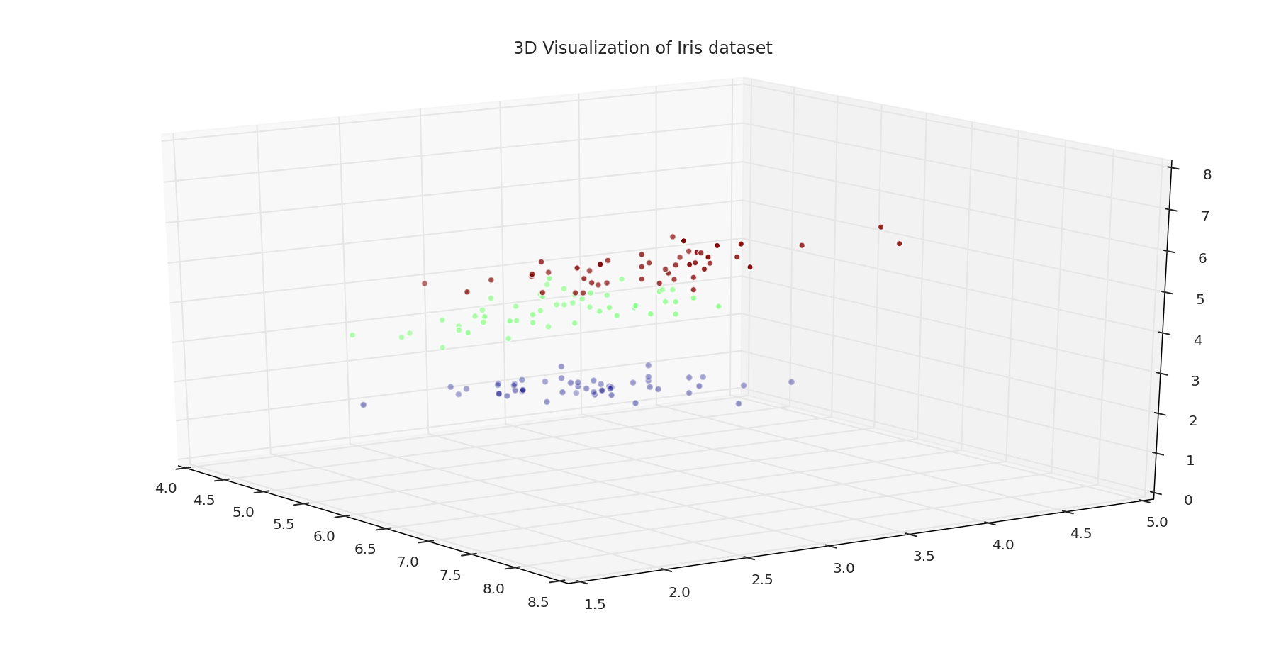
1 2 3 4 5 6 7 8 9 10 11 12 13 14 15 16 17 | # load the data and use the first column for the index iris_data = pd.read_csv('IRIS.csv', index_col=0) iris_data.head() figure = plt.figure(figsize=(16, 8)) axis= plt.axes(projection='3d') sepal_length = iris_data.iloc[:, 0] sepal_width = iris_data.iloc[:, 1] petal_length = iris_data.iloc[:, 2] labels = iris_data.iloc[:, 4] axis.scatter(sepal_length, sepal_width, petal_length, c=labels, cmap=cm.jet) axis.view_init(elev=20, azim=-35) axis.set_title('3D Visualization of Iris dataset') plt.show() |
To create a 3D plot of our dataset, let’s start by loading the CSV into our variable iris_data. Since we are dealing with a 3D plot, we should set the projection to 3D, which creates our 3D axis.
Next for the axis we assigned:
sepal_length = Xsepal_width = Ypetal_length = Z
We used the target column within the DataFrame for visualization to assign colors for each of these flowers.
Then we can change our viewing angle on our three-dimensional space by changing the elevation to 20 degrees and rotate the 3D graph by -35 degrees. Then finally, set the title of the plot.
Heatmap
You might ask yourself what a heatmap is or, even better, what it tell us. In simple terms, a heatmap is a graphical representation of data where values are represented by color. As you can see from the example below created using matplotlib, you can get an instant insight into your data at a glance.
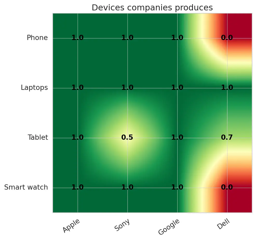
For the example above, you can see the correlation between these tech companies and the devices they each produce. For instance, take Apple; they certainly make smartwatches, tablets (known as IPads), laptops (mac), and phones (IPhones).
If you compare the data to Dell, they are quite known and famous for creating devices like Laptops and tablets. Not so much for smartwatches or mobile phones.
1 2 3 4 5 6 7 8 9 10 11 12 13 14 15 16 17 18 19 20 21 22 23 24 25 26 27 28 29 30 31 32 33 34 | # generate toy-data for our heatmap companies = ["Apple","Sony","Google","Dell"] devices = ["Phone","Laptops","Tablet","Smart watch"] data = np.array([ [1.0, 1.0, 1.0, 0.0], [1.0, 1.0, 1.0, 1.0], [1.0, 0.5, 1.0, 0.7], [1.0, 1.0, 1.0, 0.0]]) figure, axis = plt.subplots() image = axis.imshow(data, cmap='RdYlGn') # show all the ticks and label each tick with their # respected list of entries axis.set_xticks(np.arange(len(companies))) axis.set_yticks(np.arange(len(devices))) axis.set_xticklabels(companies) axis.set_yticklabels(devices) # Rotate the tick labels and set their alignment. plt.setp(axis.get_xticklabels(), rotation=35, ha="right", rotation_mode="anchor") # generate text annotations for the labels for row in np.arange(len(devices)): for col in np.arange(len(companies)): text = axis.text(col, row, data[row, col], ha="center", va="center", color="k", fontweight='bold') # setting the title and adjusting the figure axis.set_title("Devices companies produces") figure.tight_layout() plt.show() |
From line 2 – 9, we generate the dataset we will be using for this example for the exact purpose of visualization.
Within lines 10 – 11, let’s analyze the correlation between each company and the devices they produce by visualizing out all this information.
From line 15 – 18, after making the graph, the plot doesn’t necessary gives us that much information. So let’s add some numbers and on the graph to add some labelled information by resetting the x and y ticks and setting the labels for both the x-axis and y-axis.
Following lines 21 – 22, let’s rotate the axis to avoid the labels on the x-axis squeezing next to each other for rotation=35 degrees. Then set the rotation_mode = anchor. The particular reason for this circumstance is to:
- First, align the un-rotated text
- Then, rotate the text around the point of alignment
Then, from line 25 – 29, to create separate text annotations for our dataset, we will loop through the generated data and assign different text annotations.
Finally, from lines 32 – 34, let’s set the graph’s title and then adjust the padding between the figure’s edge.
Styles with Matplotlib
Styles are cascading style sheets (CSS) with Hypertext Markup Language (HTML). The valuable feature about this is you can specify what type of modification you want to make to your graph.
The way we are going to use this is to first import the style sub-package of matplotlib.
Before specifying the style, you want to use. You can see the different styles matplotlib provides by iterating through the list of styles and selecting your preference.
Then to use the specific style, all you have to do is call the plt.style.use('fivethirtyeight') method and specify which one of these styles you want to use. I suggest you experiment with all these different styles and go with one that suits your taste.
1 2 3 4 5 6 7 | # different ploting styles: styles = plt.style.available for style in styles: print(style) # to use a specific style plt.style.use('fivethirtyeight') |
Plotting Images
Up until now, you have seen that Matplotlib is incredible for generating graphs and figures. What if you want to display an RGB (red, green, and blue) image?
Can we perform this with matplotlib?
Well, of course. Let see how you can do it.
1 2 3 | image = mpimg.imread("ART.jpg") plt.imshow(image) plt.show() |
We have our matplotlib package and the image sub-package of matplotlib, aliased it as mpimg (A library which handles matplotlib’s image manipulations). We will call the mpimg.imread('ART.jpg') method that loads our image as a multi-dimensional Numpy array and plt.imshow('image') displays our image to our screen to see what has been loaded.
Let’s have a look at our image below:
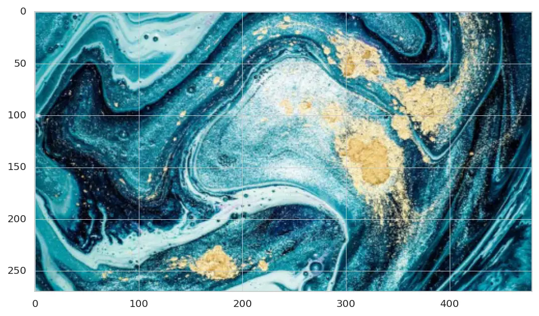
As you have noticed, we have these axes appear on the loaded image. Now the next question is, how do we get rid of these numbered axes?
1 2 3 | plt.axis('off') plt.imshow(image) plt.show() |
By calling theplt.axis('off') we can remove these numbered axes showing across our image.
Executing our code we end up with:

Conclusion
To sum up everything that has been stated so far, you have learned about various kinds of visualization charts in this post. These include line graphs, pie charts, scatter plots, histogram plots, box plots, bar plots, heatmaps, and 3D graphs.
Make sure you share this tutorial with your friends and anyone you believe this will enormously benefit. Lastly, don’t forget to subscribe to my youtube channel, where I will began providing you with video tutorials. And if you have a means, feel free to become a Patreon.
Do you have any questions about Matplotlib or this post? Leave a comment and ask your question. I’ll do my best to answer.
To get all access to the source code used in all tutorials and to be notified when this next blog post goes live, leave your email address in the page’s subscription forms.
Further Reading
We have listed some useful resources below if you thirst for more reading.


12 Comments
After looking into a number of the articles on your website,
I really appreciate your technique of writing a blog. You can be sure i’ll be back again.
Thank you very much Darci. You may also leave your email address and i’ll notify you when another tutorial is up Neuraspike.
Usually when i search for something related to a topic, i expect for contents to be available in details and i’ll confess that things are maintained over here.
Thank you very much Ana. All thanks for my wounder team/friends who assist me 🙂
Thanks David for this article. I’m thoroughly enjoying your blog. I’m too am an aspiring blog blogger
but I’m still new to the whole thing. Do you have any helpful
hints for novice blog writers? I’d definitely appreciate it.
Thanks Elke. Only keep writing and do it for sharing your own point of view to the rest of the community.
I was recommended this blog via my cousin. I’m looking forward to more real-world projects from you.
Thank you Maricru and welcome to Neuraspike. Stay tuned for more content coming up.
This piece of writing is truly a good one as it assists new students, getting into the field of Data Science.
Thank you very much Remi for the feedback.
Thanks for sharing your thoughts about Matplotlib.
You’re welcome